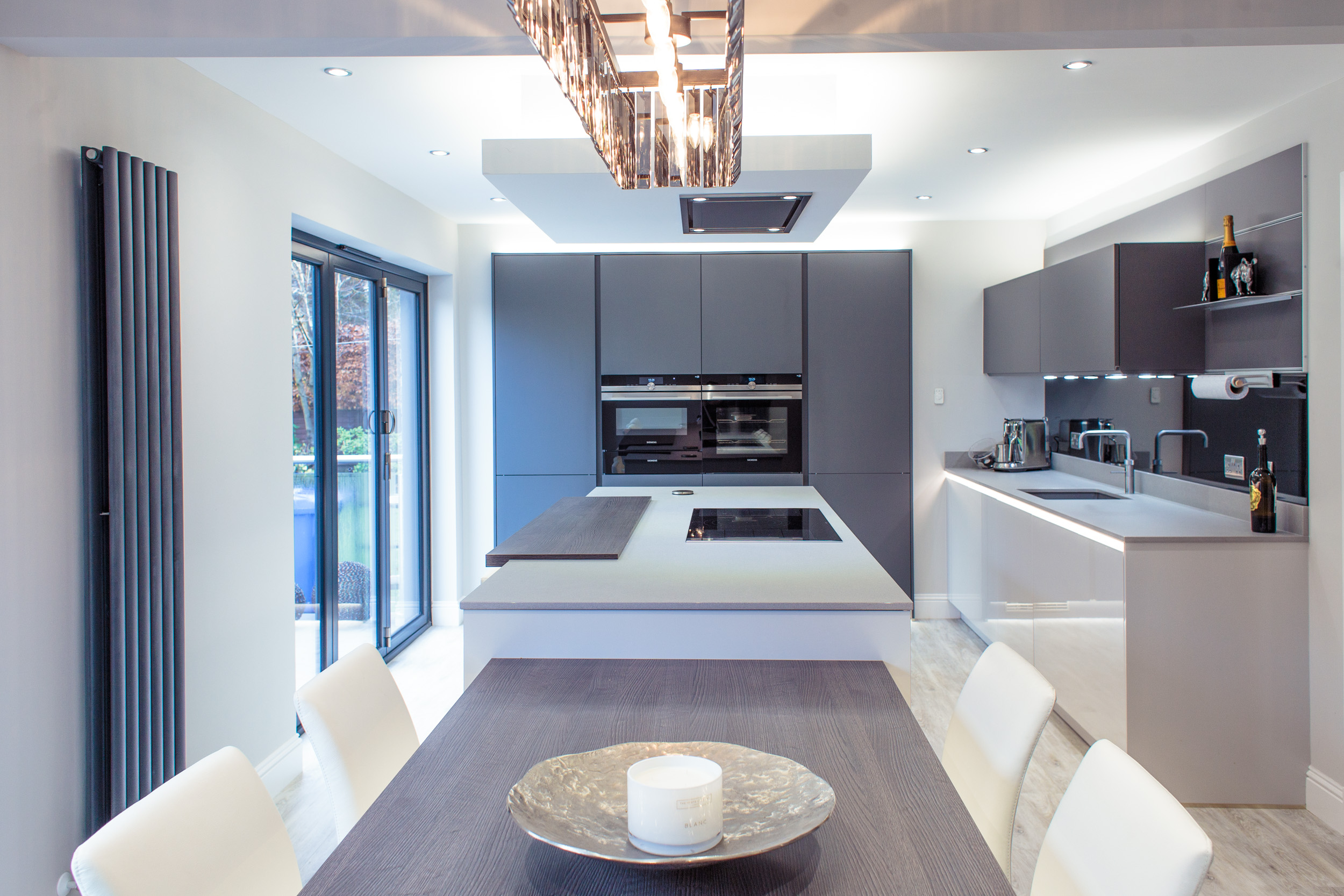
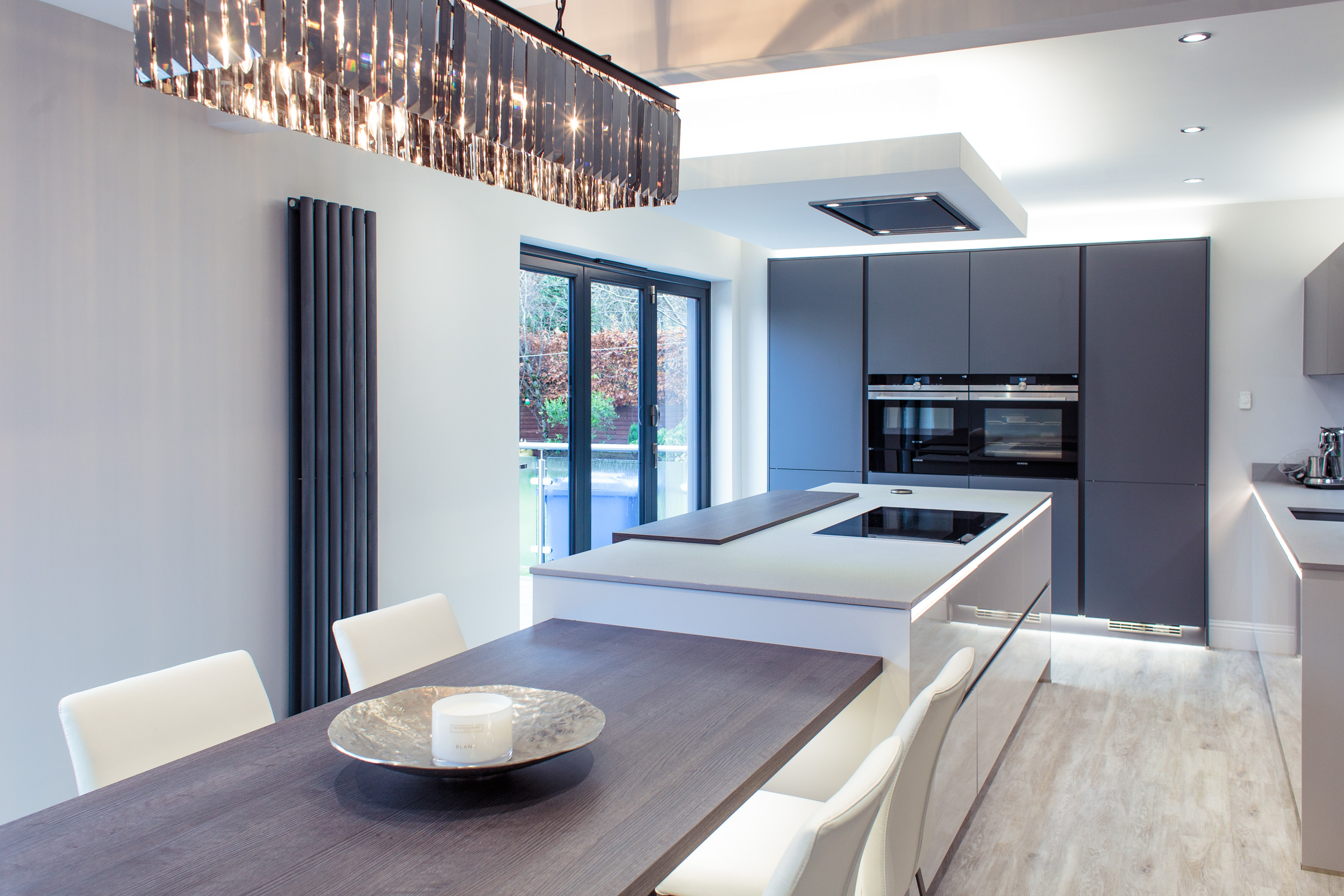
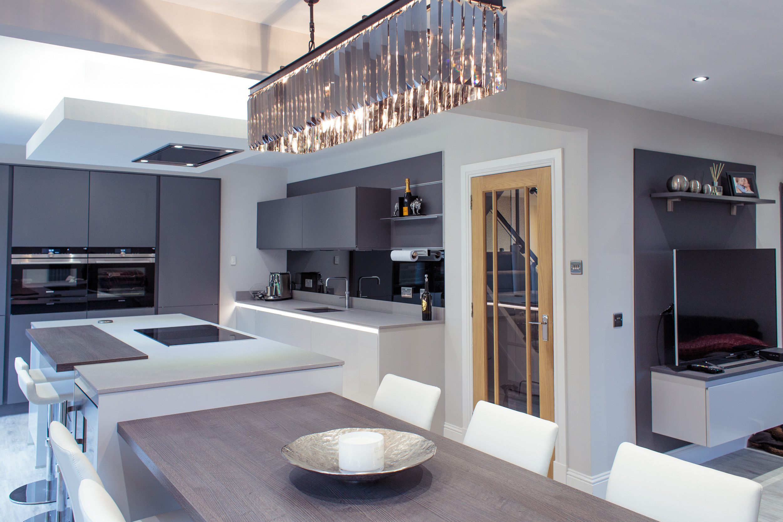
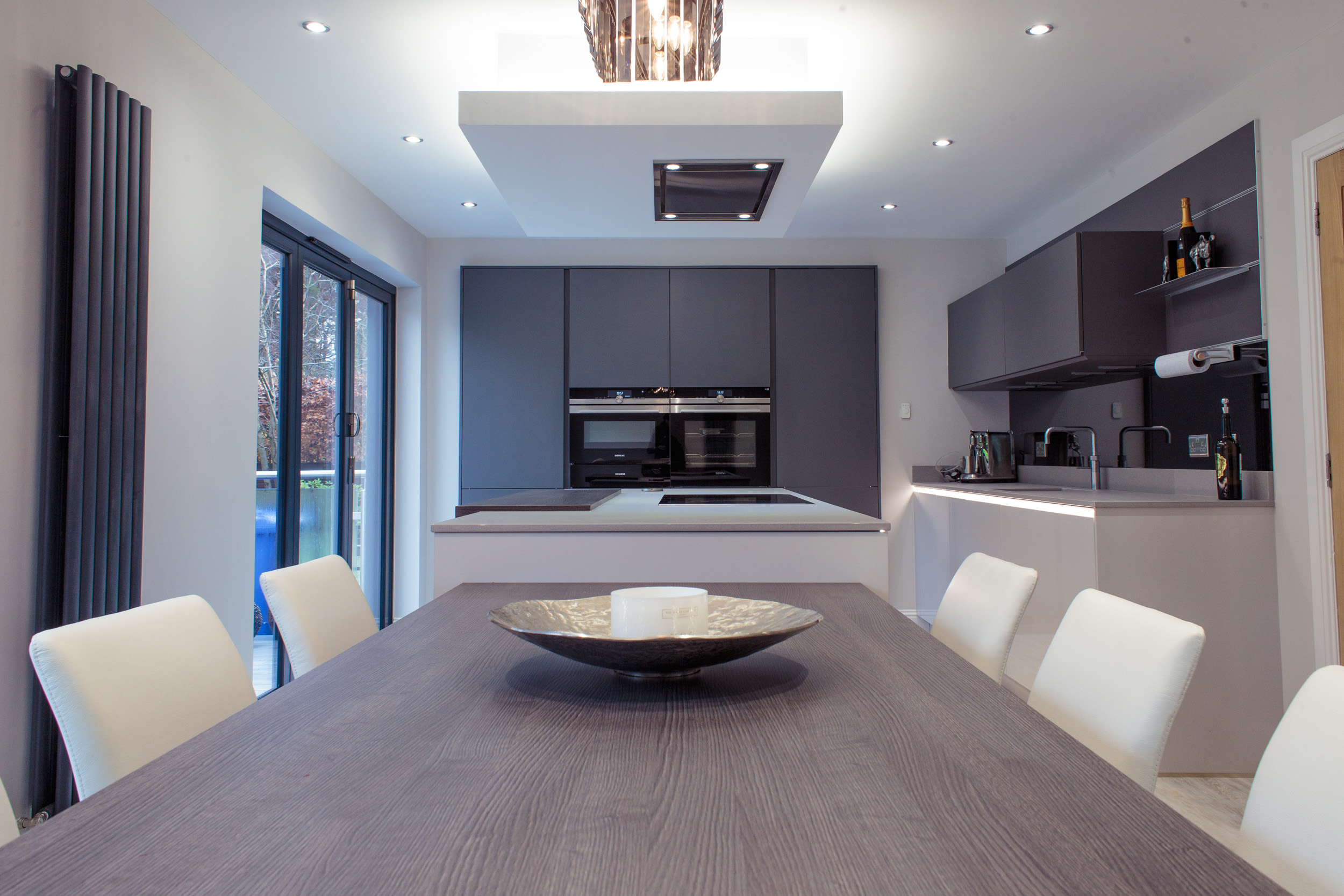
For Will’s new kitchen, we redesigned the existing kitchen/dining/living space to make the best use of the l-shaped layout and to give the client a large, sociable kitchen area with good worktop and storage space. For this reason, we chose to move the kitchen out of the small corner area and into the main stretch of the room—this allowed us to have a tall bank of units to house the ovens as well as the fridge and larder storage unit. The island and table could then cover the full length of the room and sit parallel to the sink run.
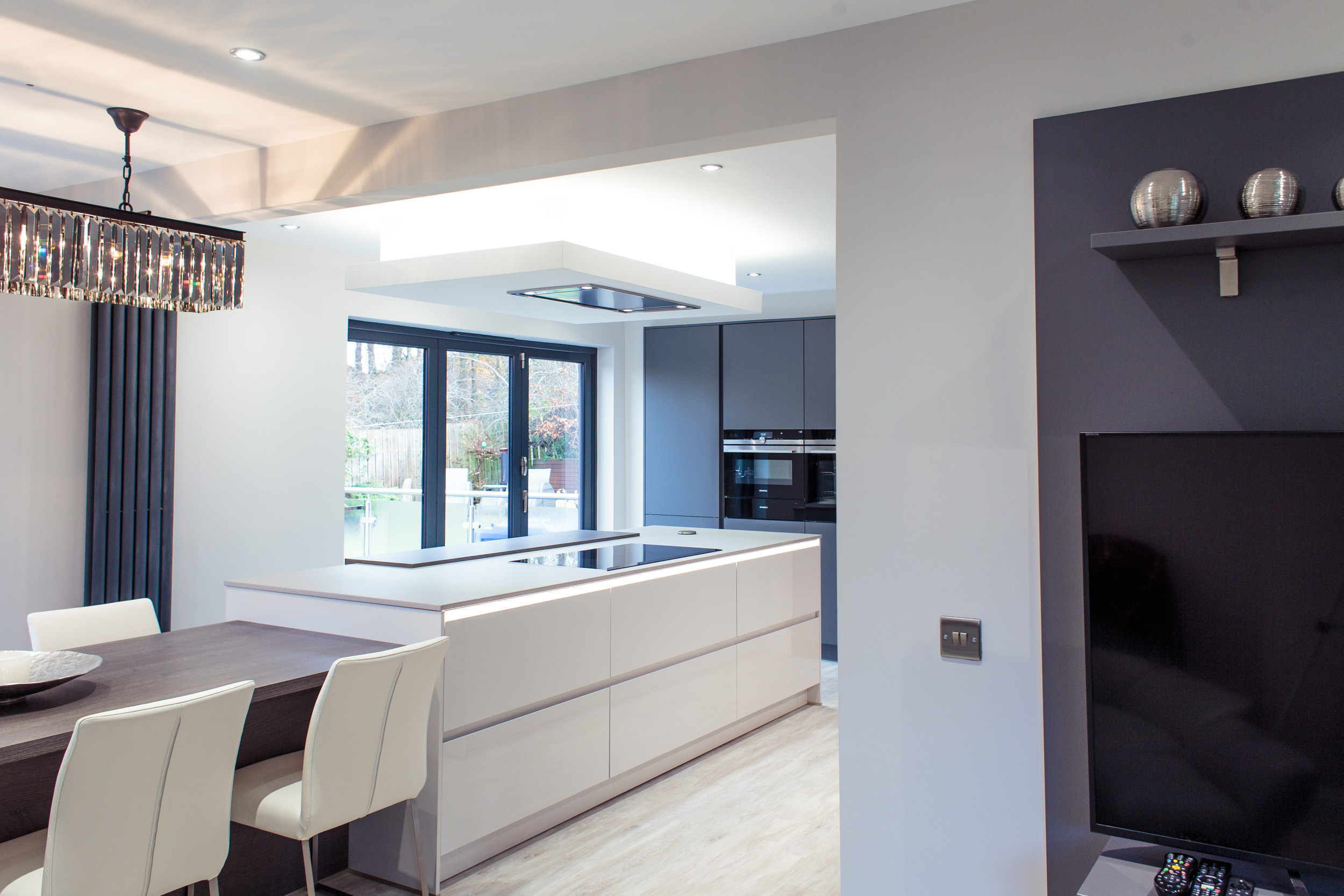
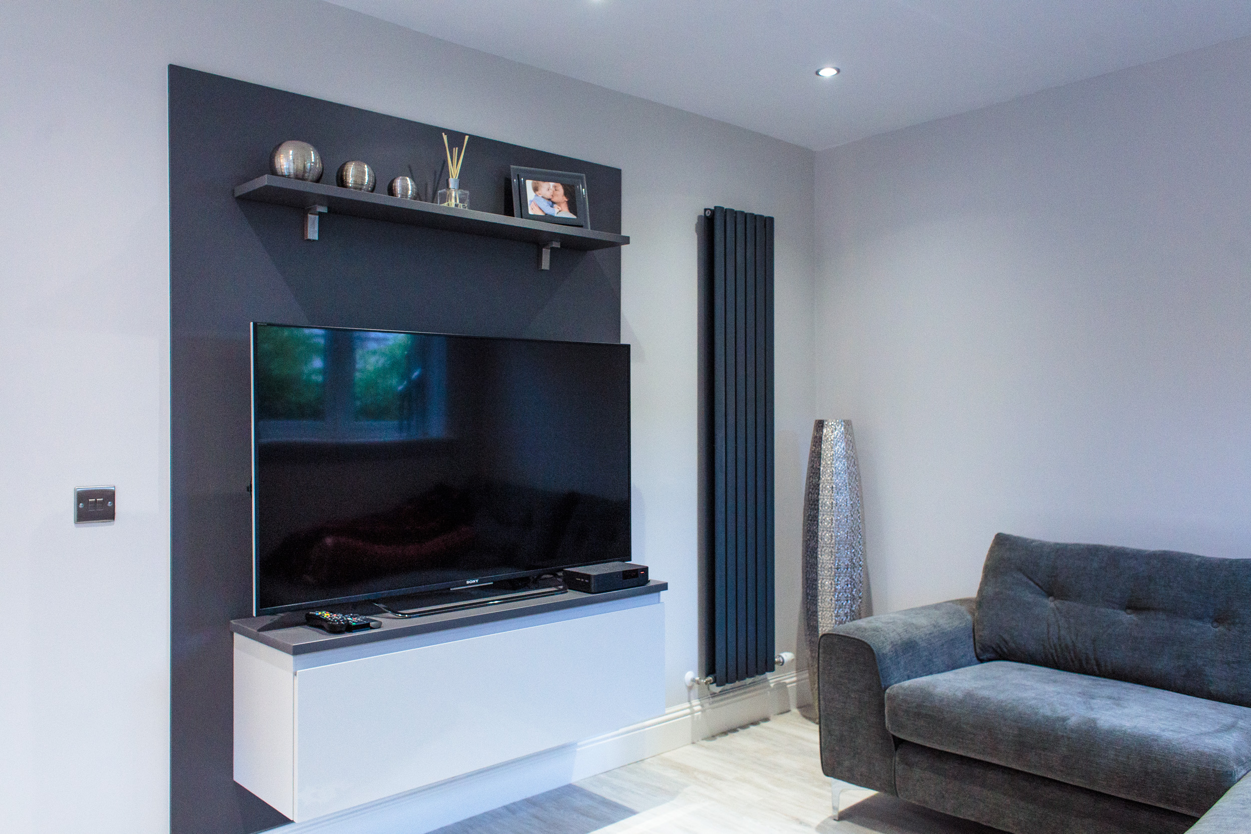
The area where the kitchen originally was became the perfect nook for a TV area with a comfy corner couch. We used the same furniture and materials from the kitchen to create the TV mounting panel and storage unit, which tied this area seamlessly into the rest of the space.
The client wanted the seating options to be flexible, offering casual seating at breakfast bar height, more formal seating at the table (conveniently located near the wine cooler!) and a lounge area with TV. This means the room is not just an area for cooking, but is the heart of the home—looking out over the large garden which is accessed via the large bi-fold door windows.
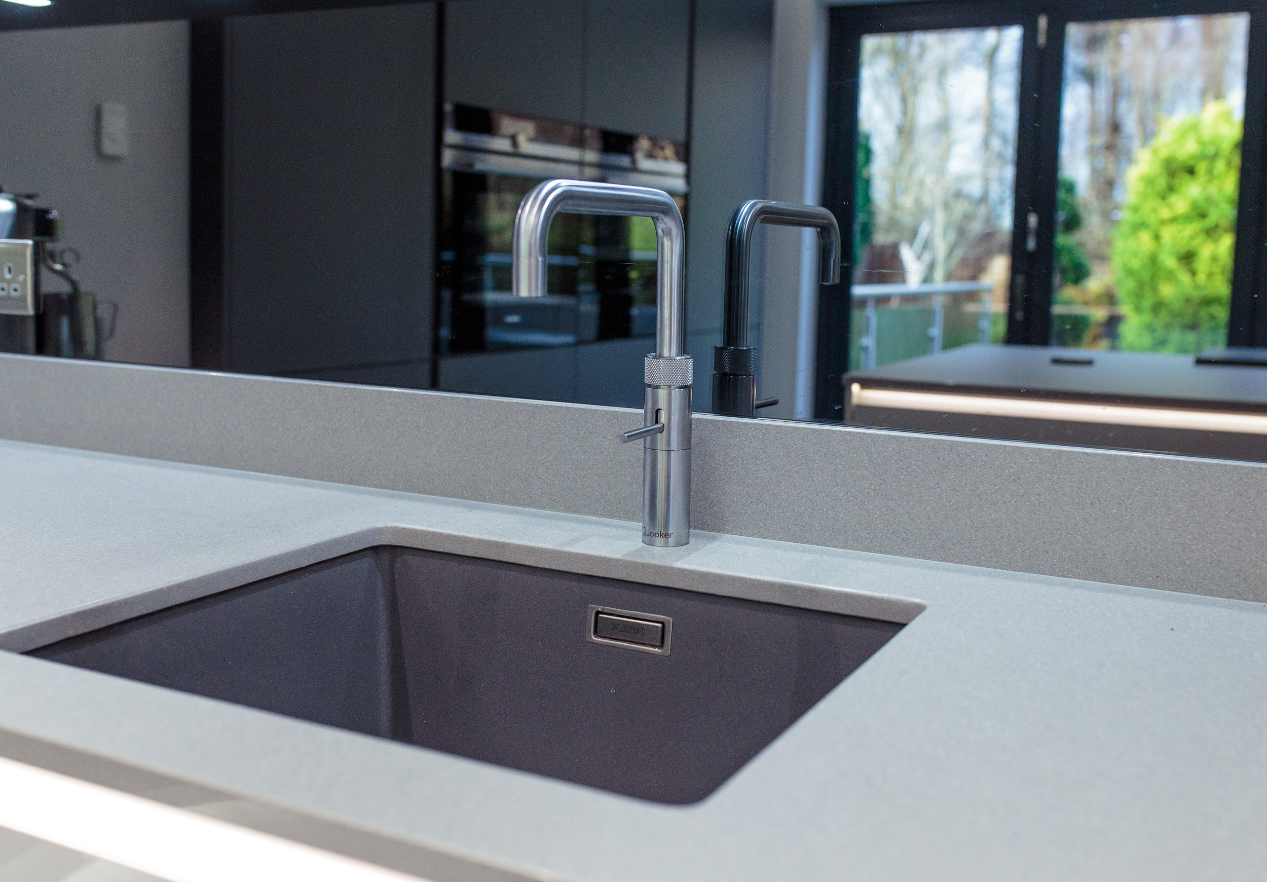
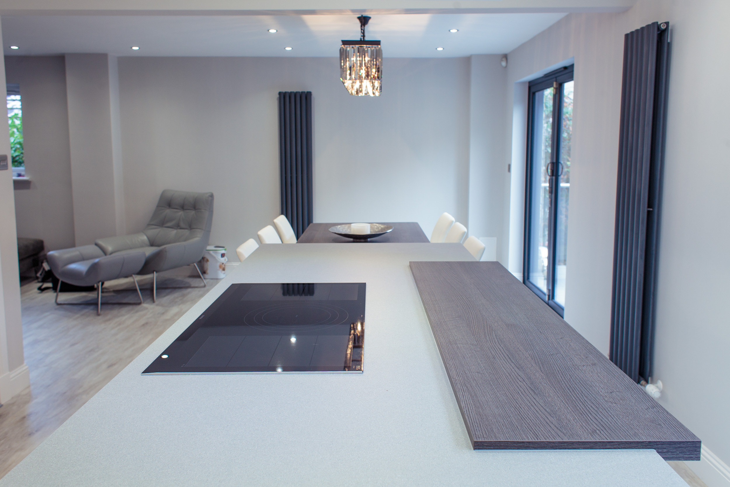
We chose a high spec of appliances to give the client the best available cooking technology, including the flex induction hob on the island and the boiling hot water tap, which eliminates the need for a kettle and frees up worktop space.
The baseline is a light grey shade which contrasts the dark grey wall units. This is a slightly softer take on a monochrome scheme and complements the mix of subtle greys used for the soft furnishings. We used a smoked grey mirror splashback on the wall of the sink run, which bounces light back into the space and reflects the colour of the tall units on the adjacent wall.
We brought a touch of contrast into the colour scheme by using the Dark Rift Oak textured wood laminate for the table and breakfast bar, which is a warmer and more durable material and adds a different aesthetic element to the scheme. The choice of light driftwood Amtico flooring combines all the tones and textures of the kitchen and makes the space feel open and airy.
The central island with breakfast bar seating and the drop-down dining table makes for an impressive focal point at the centre of the room. When the client is cooking at the hob, they have a nice view of the garden and can socialise with family and friends sitting at the table. We echoed the shape of the island in the ceiling box detail, which houses the extractor and also provides some ambient lighting with the hidden uplights that run around the perimeter and glow onto the ceiling.
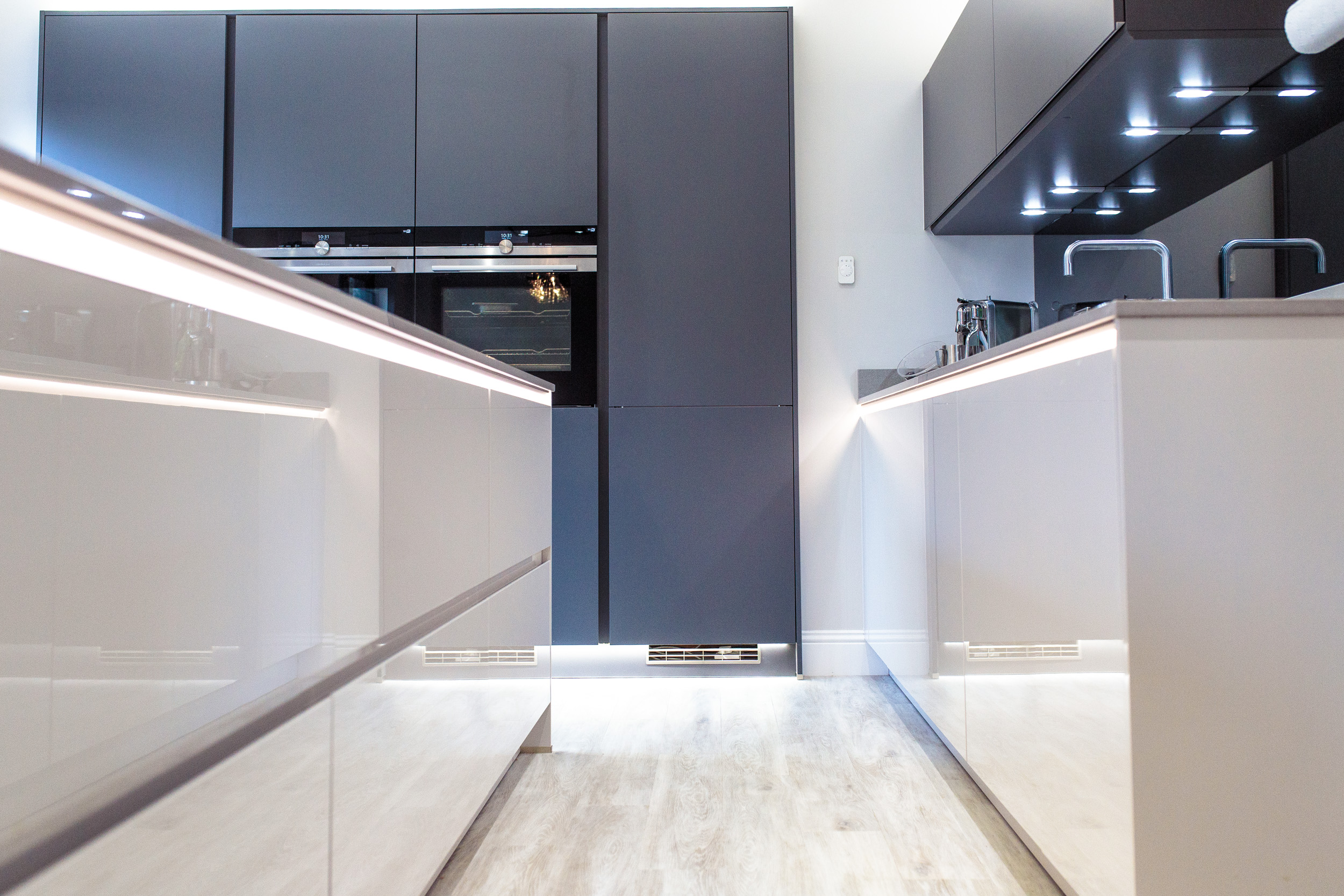
We added some shelf features at the side of the wall units and above the TV to allow the client to display some decorative items. We also incorporated some additional striking lighting features, which can be seen above and below the units, under the table, and in the handle channel of the furniture, adding a soft glow along the line of the worktop. This allows the client to alter the mood and feel of the space depending on the time of day and whether they are cooking, entertaining, or relaxing with a glass of wine on the couch.

